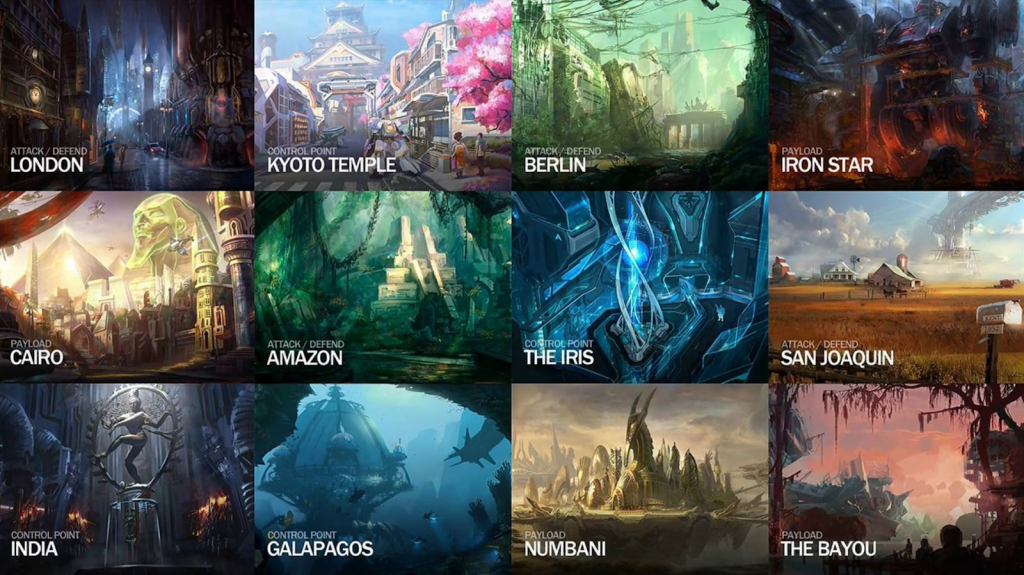
Overwatch is currently commemorating its fourth anniversary and amid those celebrations, we got a detailed glimpse at what the original concept for many of the maps looked like.
A collage of locations in Overwatch published by Twitter user Naeri made the rounds on social media. These early concept pieces showed familiar landscapes like King's Row, Temple of Anubis, Hanamura, and Volskaya, albeit under different names: London, Cairo, Kyoto Temple, and Iron Star respectively.
(Picture: Peter Lee)
Interestingly, some places like Galapagos, The Iris, and San Joaquin seem to be completely scrapped settings, or they changed drastically compared to what we ended up getting in the final release.
Read More: Overwatch Token drops are back starting with this weekend's Overwatch League
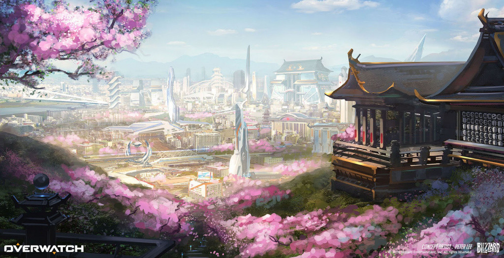
It all comes courtesy of Peter Lee, Blizzard's principal artist, as he's been sharing many pieces over the past couple of weeks on his ArtStation page.
Early concept of Hanamura (Credit: Peter Lee)
A lot of the pieces maintain a huge resemblance to the final version we get to see in-game, like Hanamura, whose clash of modern-day Japanese architecture with historical buildings like Shinto Shrines are the main staple of the map, as players on the attacking start the round in an Arcade, while the defenders do so from a temple.
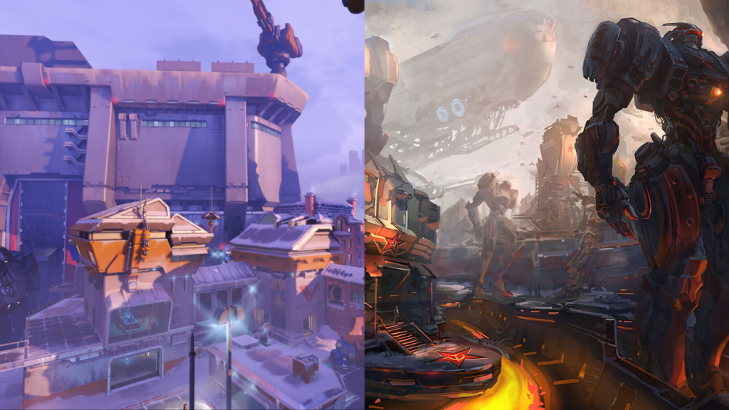
Some others, like Volskaya Industries, completely shifted in tone in order to keep everything aesthetically similar, as Overwatch is viewed as a sort of Pixar styled team shooter, with the early concepts depicting a much darker setting for the Russian location.
You can see all the concept art on Lee’s website. If you’re aching for more amazing looking artwork, take a peep at the scrapped designs for a cancelled The Legend of Zelda title.
Side-by-side comparison of Volskaya Industries (Credit: Peter Lee)

 No ads, our video library,


