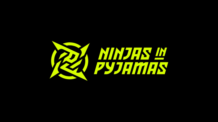
When talking about legendary European esport teams very quickly you will start to discuss the Swedish organisation, Ninjas in Pyjamas.
A part of the esports scene since 2000 and best known for their record-breaking CSGO team, they have also ventured into R6: Siege, League of Legends and Overwatch.
Whatever game they have competed in the has always retained its essence, with the logo of its characteristic shuriken being famous in all competitions.

However today in an unexpected move they have announced a brand new look for the organisation.
The rebrand retains the shuriken but gives it sharper lines, the font for Ninjas in Pyjamas has changed from American university sports team to something with a Japanese flavour.
The most startling difference is the colour palette gone is the muted gold, replaced with lime green.
“Neon is inspired by the beautiful neon lights of Tokyo, the primary colour neon yellow and neon blue is inspired by Sweden. It is a true Japanese-Swedish fusion with a digital touch," explained Hicham Chahine, CEO of Ninjas in Pyjamas, to Esports Insider.
Which is sounds great but the reality is very different and the rebrand hasn't gone down well with many, no more so other esport organisations who have been dragging the team on Twitter.
TSM referenced Sonny's death in the Godfather Part I.
While Dignitas who know a thing or two about second-guessing a rebrand described their disappointment as "immeasurable".
Ninjas in Pyjamas are not the only organisation to have gone through a rebrand in the few weeks of 2021. As mentioned before Dignitas announced last week they were reverting to their previous logo but with a twist.
Korean organisation Damwon Gaming rebranded to DWG KIA after a sponsor deal with car manufacturer KIA. Rogue is also sporting a new, more streamlined, look.

 No ads, our video library,


